Pillar · Creative Direction
Type · Concept Campaign / Brand World
Lane · Culture / Community / Spatial Identity
THIRDSPACE — A Campaign for Modern Connection
🪞 Overview
The youth of today are more connected than ever — yet feel more isolated than ever.
THIRDSPACE is a speculative campaign concept exploring how cities, brands, and creative communities can reclaim the need for real-world connection through modern design, storytelling, and culture.
The idea is simple: every city needs third spaces — places that aren't home or work, but where people can meet, share, and belong.
Objective: To show how Heno leads campaigns that combine storytelling, community, and spatial identity — turning an idea into an experience.
Services
Creative Direction
Campaign Design
Narrative Design
Focus
Youth Culture
Community Hubs
Spatial Identity
Platform
OOH / Social
Digital Rollout
Physical Pop-up
Tools
Figma
Adobe Suite
Stable Diffusion
🧩 The Challenge
In the digital era, organic connection has become rare. Third spaces — community hubs, cafés, and creative venues — are disappearing, replaced by consumption-driven environments.
Young people crave authentic community, not just content. They're searching for spaces where they can feel grounded, inspired, and seen.
Creative question:
How can storytelling, design, and campaign strategy ignite a movement that redefines what “community space” means today?
🎨 The Approach
THIRDSPACE is designed as both a campaign and a conceptual framework — a modular idea that could be adopted by councils, collectives, or brands.
The campaign is built on three pillars:
- Narrative Design – establishing emotional resonance and a sense of belonging.
- Visual Language – crafting a soft, human aesthetic grounded in light and openness.
- Rollout Architecture – a clear campaign lifecycle (tease → reveal → sustain).
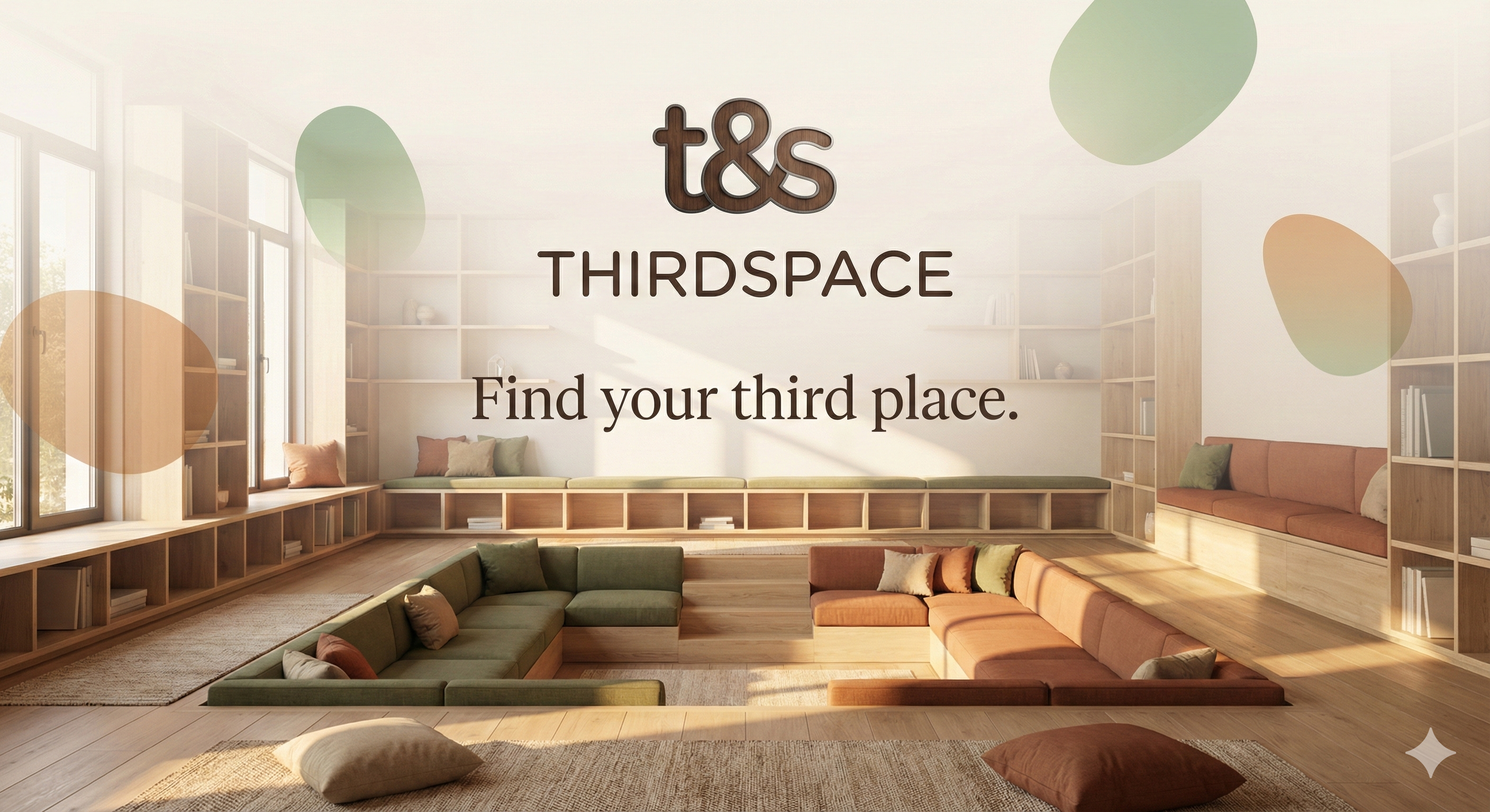
Core Message
“Find your third place.”
The line becomes a call to action — not to buy, but to belong.
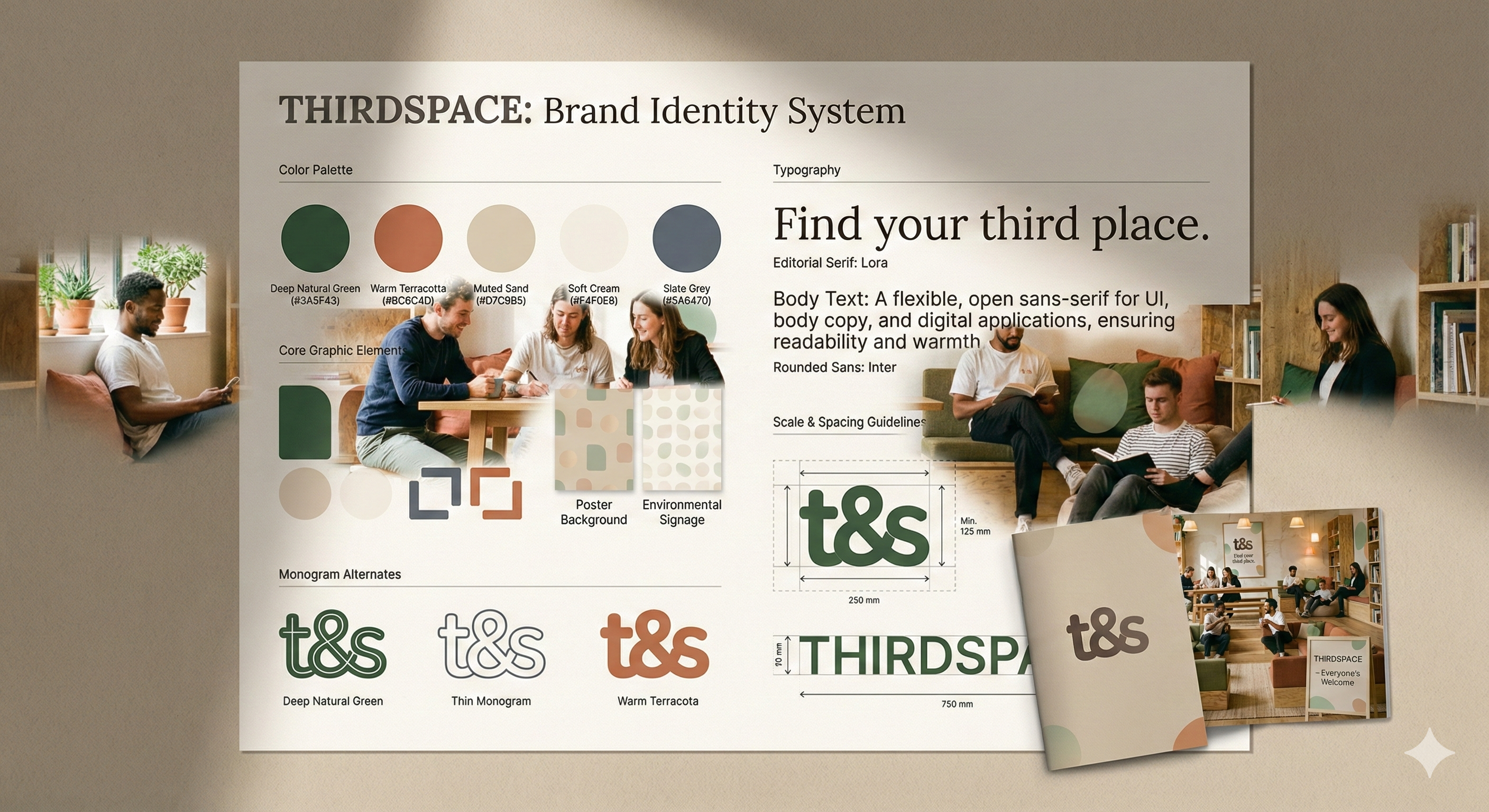
🪞 Visual Identity System
Colour
Soft natural neutrals with deep natural green and warm terracotta accents — representing calm, openness, and inclusivity.
Typography
Rounded sans-serif for accessibility and UI; editorial serif for campaign headlines and key statements.
Imagery
Candid, human, and warm. Sunlight, conversation, shared moments instead of polished staged ads.
Logo Concept
A geometric t&s monogram forming an open, inviting shape — a literal space for connection that anchors the brand.
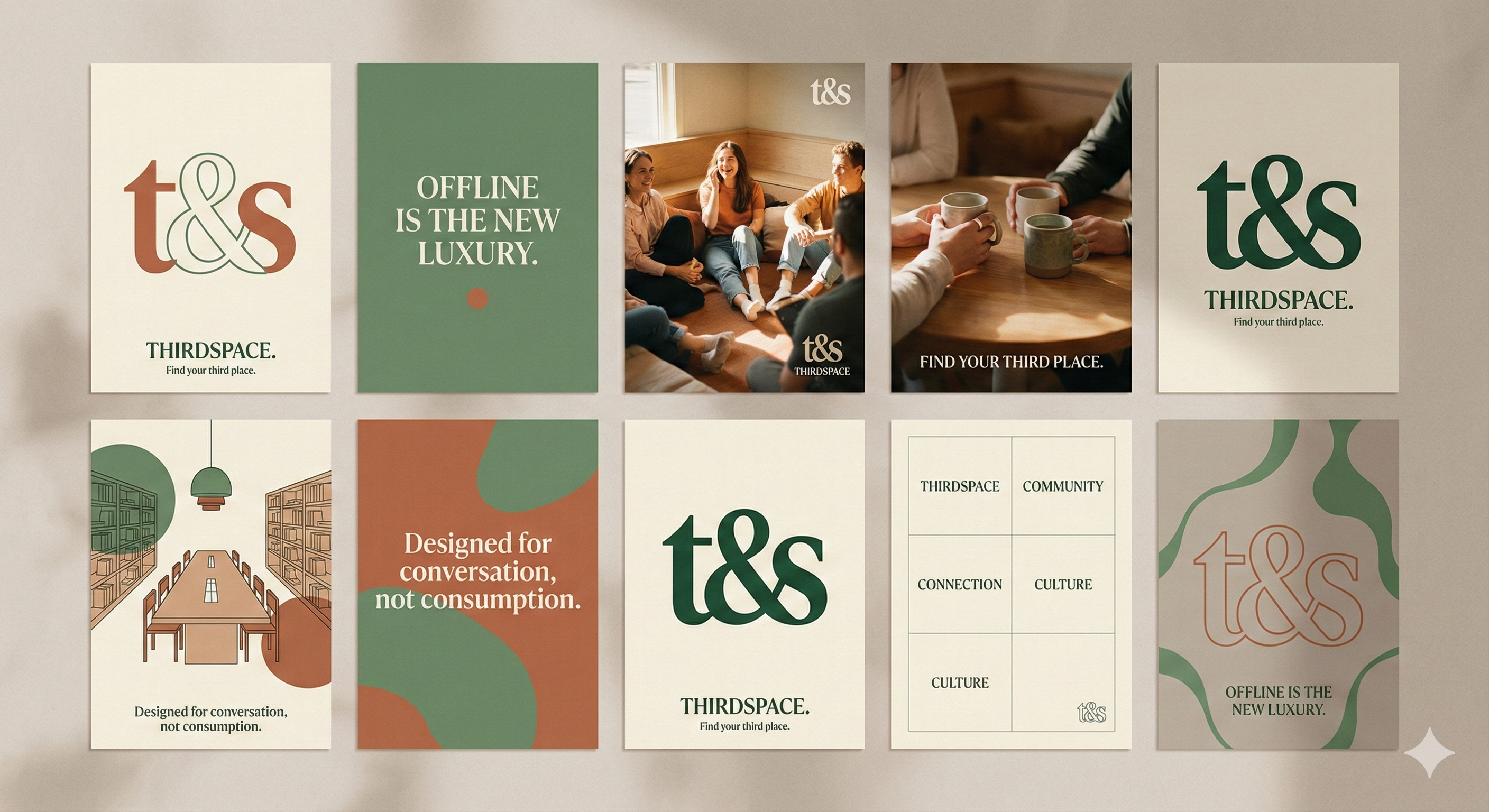
Taglines
- “Offline is the new luxury.”
- “Find your third place.”
- “Designed for conversation, not consumption.”
Identity · Selected Screens
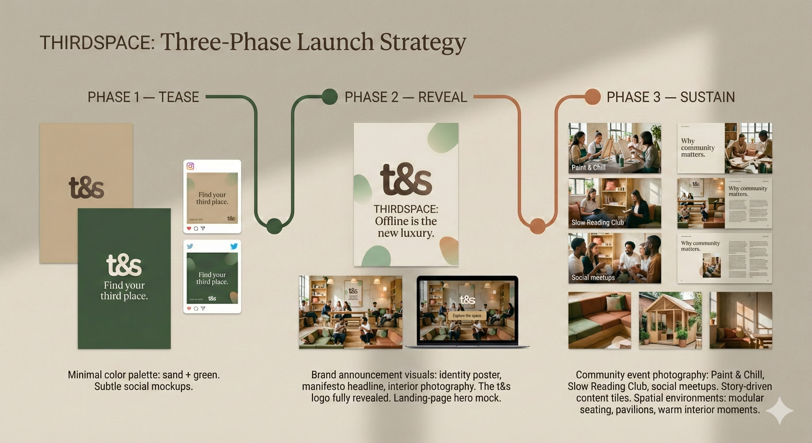
🧭 Campaign Rollout Strategy
Phase 1 — Tease
Cryptic posters and short social clips hinting at something called “THIRDSPACE”. Minimal visuals. Only the tagline: “Find your third place.”
Phase 2 — Reveal
Brand announcement visuals: identity poster, manifesto headline, interior photography. The t&s logo fully revealed. Landing page hero launches with event signups.
Phase 3 — Launch & Activation
Pop-up installations across London — modular builds for creative meetups, workshops, and music sessions, supported by a content series spotlighting real people’s stories of connection.
Phase 4 — Sustain
Monthly themes (creativity, wellness, collaboration) and community-generated content: stories, playlists, local partnerships, and ongoing events.
Rollout · Three-Phase Diagram
💡 The Experience
Beyond the digital campaign, THIRDSPACE can manifest as modular pop-up venues — minimalist pavilions that host creative events, study zones, and open mics. Each pop-up adapts to its environment: parks, rooftops, and empty storefronts, while retaining a consistent, neutral, and welcoming visual language.
🚀 Outcome / What It Shows
THIRDSPACE demonstrates Heno’s Creative Direction capability — the ability to conceptualise and design campaigns that go beyond visuals, touching on human experience, cultural insight, and real-world impact.
It’s not just branding — it’s community storytelling. It proves that modern creative direction isn’t about ads; it’s about designing spaces for belonging.